I've officially decided that Monday Sketches will be an every-other-week segment until further notice. Life's been pretty crazy as of late, so remembering to keep at it with a weekly post is not as easy right now.
This week, I have a few school assignments to share with you, and some personal projects that have stemmed from the fact that my Midpoint Review was not approved.
It sucks when something you've worked hard at is (essentially) rejected, but after a couple of weeks of fretting and worrying, I think I'm starting to think a little more clearly about it. In the end, I just have to keep drawing and keep working - and I'll get there. Like Dory says in Finding Nemo:
Just Keep Swimming!!
 |
| Image from http://blogs.disney.com/oh-my-disney/2013/06/26/the-best-dory-quotes/ |
Without further ado, here is the art for the week!
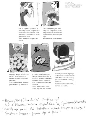
My next big Advertising Illustration class assignment is creating an Ad based on a genre. Being the big Jane Austen fan I am, I chose Regency Romance as my theme. I sketched out a few thumbnails, and the instructor ended up choosing number 4 as the best one to work from.
After taking some photos for reference, I managed to piece together my images to create a final sketch/tonal drawing of the image in Photoshop. I think once I start throwing in color and playing with media, this will turn out to be a really nice image. I'm thinking either watercolors or gouache would do nicely, as long as I don't focus too much on the linework. Last time I focused on line, it ended up in a not-so-great grade. No fun!
For Interactive Illustration class, we're starting to build the environment for our character. For my fortune teller, I placed her in a run-down room filled with odds and ends to bring back the Steampunk quality to the image. Astrological signs, tarot cards, drapery and electric lights all pull everything together. Looking forward to starting to create this in Adobe Illustrator!
Butterflies are one of my favorite things in the world, and after playing some in Adobe Illustrator I decided to make a fun, light hearted image with lots of these little guys!
Playing with media and styles here with this fashionable lady. My husband challenged me to combine a couple of art styles, and his suggestion really has helped me with understanding and coming to terms with the rejection from my Midpoint Review. His support has been invaluable this entire time, and I'm so thankful for him!
In this image, I used a reference I found on the internet and just drew. I did a lot of crosshatching and shading, and the end result was a lot of fun! I might try experimenting with it some more.
One of my favorite artists is Duane Bryers, who created pin-up art of this adorable and fun-loving character, Hilda. She's a chubby, chunky ball of energy whose every illustration is colorful, sexy, and exudes confidence. It's this character that helped me with finding a voice as a Body Positive artist. In this image, I copied an image of her to get a feel for the vignette style art that's so common in Pin-Up drawings. It was a lot of fun, and I hope to do more - only with my own characters!
You can find out more about Hilda and see more of Bryer's paintings at this blog post here.
That's all for now, until next time!


No comments :
Post a Comment